Questions
Apr07
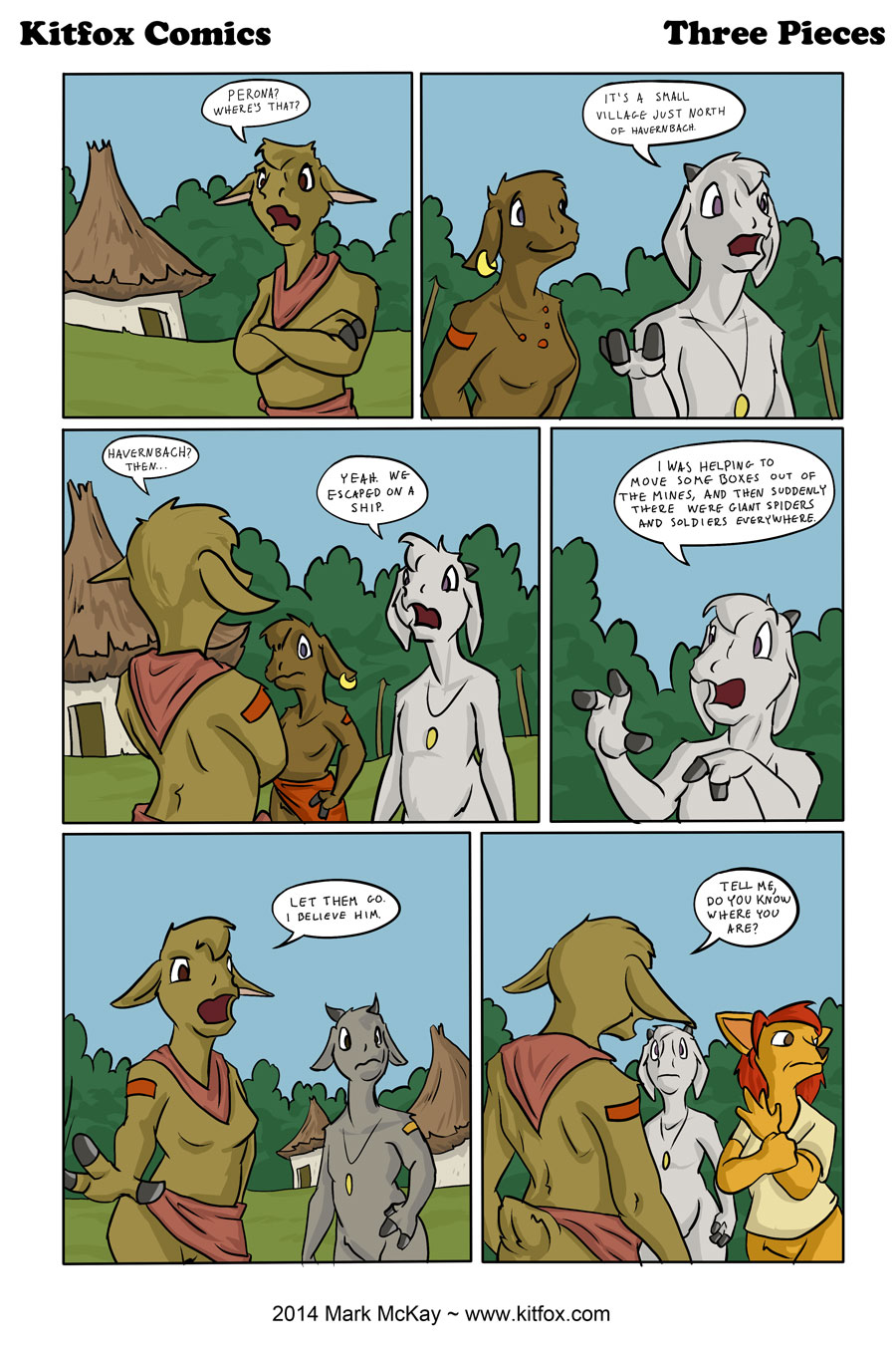
So I just discovered the ‘line smoothing’ setting on my paint program – and it makes drawing so much easier. It’s almost like having a magic checkbox for ‘draw better’. It acts by smoothing out your strokes so that lines appear straighter. This makes the undersketch much less scribbly, which makes for a better foundation for drawing the rest of the comic.
Trying a new lettering style. This way things are more compact so I can put more words on the page.


It also makes it harder to read; especially “Havernbach” in the second panel. (I really like the girl’s expression in the second panel though!)
Looks good!
The new narrow handwriting is kinda hard to read, but you are getting better at drawing the characters.