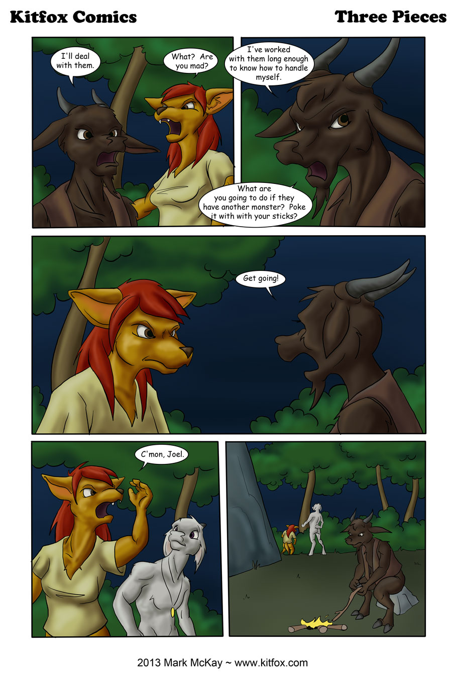
Get going
I’ve been getting into Python lately (the language, not the comedy troupe or the snake). I must say that I’m not a big fan.
(Programmer rant follows)
If you’ve never used it, it’s a lot like BASIC, but is a PITA about whitespace. Now I am all for proper formatting of code, and am quite a sticker for it in my C++ and Java projects. However, white space should be for formatting only and not be a syntax element. One missed indentation, and not only does your program not work but you have a very hard to find bug where the body of your loop had just been cut in half. This also makes cut and pasting blocks of code much more difficult.
Also why no block comments? Block comments are one of the best ways to search for bugs by temporarily removing large chunks of code. Very time consuming with the single line comments. Any what’s with the ‘for’ statement only handling lists? This completely messes up iterators that use ‘break’ and ‘continue’.
I just don’t see what the big appeal is with this language. Sure, making sure your code is nicely formatted is a very useful thing to do. But you shouldn’t force this to happen by sabotaging the language.


Wow; you’ve been working on something! This page looks great!! I especially like April in the first and third panels and Bartholomew in the first two and the last. The expressions, the lighting, and just the drawing details in general. I think April’s face in the third panel is overall my favorite art point, but the whole panel has a lot of depth to it. I’m guessing that dark blue background just really points up both characters a lot, but especially April with her light coloring. Very, very nice!!
Thanks. 🙂 I’ve been studying anatomy lately. The dark blue does help to bring things out. Bart was blending into the sky in the first couple of panels until I darkened things down further.
I have been reading your comic ever since the forest was set alight to deal with some spiders. I am impressed with your story and your art in this last few panels has been amazing. I really like panel 3, the intensity is obvious and the colouring is very well done.
A few things about panel 4, I am assuming April is gesturing for Joel to follow her. I am a little confused by her static hand gesture, perhaps motion lines would help. Also the shading suggests that April is holding a torch or some other light source out of frame. If the light source was solely the camp fire April would be back lit and possibly just a silhouette. I run into this kind of issue with night scenes and the extreme amounts of shadowing they have. Over all very well done.
Thanks. Yeah, I was trying to go for a silvery moonlight from the upper left, but it’s not the best rendering job. Drawing rounded forms is not easy, and trying to control your light sources adds extra complications. Glad you liked the rest of it, though!